
Colour, type and the components everything else is built from
The colour ramp comes straight from the brand designer's WCAG document — these are their tested values, not derived ones. What is designed here is the system on top: which colour does which job, which pairings are approved, and how every component behaves in every state.
The one constraint that shapes everything
None of the four core brand colours can carry white text at small sizes. So white is the reading background, the two dark shades do all the work that needs white text, and the four light tints do all the work that needs a colour field. Core red is reserved for large display moments only. Every pairing below has been checked.
Colour
Four brand families, each with a light tint, a core and a dark shade. Read the row of allowed text under every chip — that is the rule, and it is not negotiable.
1.1 The ramp
1.2 Neutrals
Shadow #58595b is the brand neutral and carries all body text. The surface, border and ink values below are derived from it — they are not in the brand pack, so flag them if the brand designer wants a say.
1.3 Which colour does which job
Colour carries UI meaning, not service identity. There is no green Making Moves or orange Military Matters — that decision is already made. The one exception is the turquoise family, which belongs to Hospital Housing Clinic.
1.4 Never do this
These are the failures the old site was pulled up on, and the ones this palette invites. Shown here so nobody has to guess.
Typography
Barlow throughout — no pairing. It is a low-contrast grotesque with open apertures and unambiguous letterforms, and adding a second family would only cost legibility for people the site exists to serve. Hierarchy comes from size, weight and space instead.
Base body is 19px at 1.7. That is deliberately larger than a typical charity site: the core audience is older and disabled people, and the reading surface is white. Everything scales fluidly down to a 34px H1 on mobile, and the page must survive 200% zoom without a horizontal scrollbar.
Measure
Body copy caps at 66 characters. Long-form inner pages sit in a 720px column with the sidebar beside it, never full-bleed text.
Sentence case
Every heading, every button, every nav item. The only capitals in the system are the eyebrow label, and it is never load-bearing.
Weights in use
400 body, 600 headings and UI, 700 H1 and display. Three weights, loaded once. No 300 — it thins out at small sizes.
Spacing, layout and shape
A 4px base. Space is the main tool for calm here — when a page feels cramped the answer is a bigger step, not a smaller font.
Container
1200px max, 32px gutters on desktop, 20px on mobile. 12 columns, 32px gap.
Section rhythm
96px between page sections on desktop, 56px on mobile. Adjacent tinted bands never touch — white always separates.
Radius
Pill is reserved for interactive elements only — buttons and filter chips. 12px on cards and panels, 8px on inputs, 4px on category labels, 0 on full-bleed bands.
Elevation
Flat by default. Cards use a 1px #ece9e6 edge; a soft shadow appears on hover only, so the page never looks busy at rest.
Tap targets
48px minimum on every interactive element, with 8px clear between neighbours. Above the 24px WCAG 2.2 floor on purpose.
Imagery
Real commissioned photography, 12px radius, no filters or duotones. People and homes, never abstract stock.
Icons
Outlined line icons, 40px, 1.7px stroke in #284947, rounded caps and joins. One concrete object per icon — a house, two people, a clipboard. No filled shapes, no illustration, nothing decorative next to the photography.
Cards in a grid
Equal height, with the link pinned to the bottom edge so links align across the row whatever the copy length. It is the difference between a composed grid and a ragged one.
Form fields
Labels above, always visible, never placeholders doing the labelling. Hints sit between the label and the field so they are read before the input, not after. Fields are 56px tall with a 2px #767779 border, which meets the non-text contrast rule.
Before you start
This form will not time out, and you can complete it for yourself or someone else. Our service is free.
The Get Help form itself is built by Tay Fusion and is not being rebuilt. These tokens — 56px height, 2px #767779 border, 8px radius, labels above, this focus treatment — are what gets handed over so their form can be restyled to feel native.
Cards
Four variants cover every grid in the site. All share the same edge, radius and hover lift, so the client can mix them on a page without it falling apart.
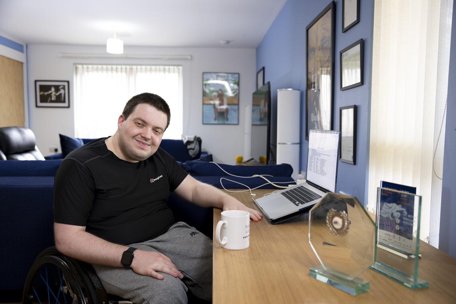
 Aiesha Marr
Housing Options Broker
Aiesha Marr
Housing Options Broker
Download card and person card. Both reuse the same edge and hover as the image cards.
Accordions, tabs and the announcement bar
Accordions are how a page gets more useful without getting longer. They start closed, they are keyboard operable, and the whole 64px row is the target — not just the words.
Audience switch
Selection is carried by weight, colour and a 4px underline together — never colour alone.
These look like tabs but they are deliberately not built as an ARIA tab pattern. A real tablist promises arrow-key navigation between tabs and a panel for each one; half-declaring it is worse than not declaring it at all. These are two pressed-state buttons pointing at one labelled group, which is honest, needs no keyboard trickery, and behaves predictably with a screen reader.
Announcement bar
We're going on tour this autumn. Five cities, September and October. See the dates
Dismissible, remembered, never auto-rotating. One message at a time.
Filter chips
The step sequence
The component the whole project turns on. Users could work out they were eligible but could not picture the service, and that stopped them getting in touch. This is the pattern that answers it — shown here as a system component; the full treatment lands on the service page.
What happens when you contact us
No forms to chase, no waiting rooms. Here is exactly what to expect, start to finish.
-
You tell us a little about your situation
Fill in our short form, or ring and leave a message. You don't need to have every answer ready.
-
A real person gets in touch
One of our brokers will contact you within [response time to confirm], by phone or email — whichever you asked for.
-
We work out your options together
A proper conversation about what you need and what is realistic — buying, renting, adapting, sheltered housing, or somewhere to go right now.
-
We stay with you for as long as you need
Applications, paperwork, phone calls to other organisations. We don't hand you a leaflet and wish you luck.
Every number is a real ordered list item, so a screen reader announces "1 of 4". On mobile the numbers drop to 48px and the connecting rule stays — the sequence is the point, and it must survive the narrow column.
Focus, motion and the accessibility floor
Focus ring
A double ring: 3px of the background colour, then 3px of #284947. It reads on white, on tints and on photography, and it never gets swallowed by a coloured button.
The old site was flagged for missing focus outlines. Never remove this without replacing it.
Skip link
First thing in the tab order on every page, visible the moment it takes focus.
Skip to main contentMotion
Transitions are 150ms and limited to colour, shadow and 2px shifts. The logo never animates — the rotating-mark idea was considered and rejected as dated and an accessibility risk. If something genuinely needs movement, use a short video the person chooses to play. Nothing autoplays, nothing loops.
Still to confirm before build: the third impact figure (7 in 10 is our recommendation), sign-off on the remaining survey quotes (five are cleared, the rest are marked “check”), and the donation impact statements. The first two impact figures, the Get Help timescales and the “Supporting the sector” name (previously “Services for partners”, not finally agreed) are decided and documented in section ten.
Quotes, video and telling people how long things take
Four components added after the client review. The first three exist because Housing Options Scotland's best evidence is what clients say about them, not what they can count. The fourth exists because the real answer to “how long will this take” turned out to be six weeks, and a number that size has to be designed, not just printed.
10.1 Client quote
Quotes come from the anonymous client survey, so there is no name and no portrait. That is a constraint worth leaning into — without a face to look at, the words have to carry it, so they are set large and given room. Never dress an anonymous quote up with a stock photo of a stranger.
They took the time to understand what I actually needed, and then they stayed with me until it was sorted.
I had no idea where to start. I do now.
Real <blockquote> inside a <figure>, with the attribution as the caption, always on the same light grey ground — one colour for quotes everywhere, so they read as the same voice across the site. No decorative quote marks — at this size the indent and the ground colour already say it is speech, and a giant apostrophe is the fastest way to make a charity site look like a template.
10.2 Impact: numbers and a voice together
This replaces the four-figure stats row. Two or three numbers carry the scale, one quote carries the meaning, and the quote gets the same visual weight as the numbers rather than being tucked underneath them. It also works if the numbers change or one gets dropped.
I felt listened to for the first time in two years.
If the quote rotates, it changes on load only — never on a timer. Text that moves while you are reading it is a genuine accessibility failure, and it is also just irritating.
Agreed at the 28 July meeting: clients helped (over 2,000 in 2025 to 2026) and local authorities covered (31 of 32). A third is recommended but not yet confirmed: 7 in 10 clients tell us they understand their housing options better after speaking with us. The out-of-five satisfaction scores stay in the annual report.
10.3 Video
The broker film does a lot of work across the site. It is a person explaining something, so the treatment stays quiet: a real still from the film, a clearly labelled play control with the running time, and a transcript link that is always visible — not hidden behind the player.
10.4 Telling people how long they will wait
The Get Help form can take up to six weeks. That is a long time to admit to, and the temptation is to soften it or bury it. Both would be worse than saying it plainly — someone who is not warned will assume they have been forgotten and will either give up or send the form again.
Two rules make it work. First, the urgent route is a different door, not a faster queue — so it sits above the timeline as its own block, never as a footnote inside it. Second, never show the six weeks as a bare number. Show the stages, and name the reason for the longest one. People tolerate a wait they can picture.
If you are facing homelessness, you will not wait six weeks
Every enquiry that mentions homelessness is looked at within 24 hours and acted on if it needs to be. Say so in the form, and we will pick it up.
What happens after you send the form
The whole thing can take up to six weeks. Here is where that time actually goes, so you are not left wondering.
-
We read your form the same week
You will get an email confirming it arrived.
-
Anything urgent is pulled out within 24 hours
Homelessness cases do not wait for the steps below.
-
You are matched with a broker at the start of the month
This is the part that takes the longest. We allocate enquiries once a month so that everyone gets a broker with time for them, rather than a quick reply and then silence.
-
Your broker gets in touch to arrange a proper conversation
They will listen, go through the options with you, and give you practical steps you can actually take.
Already sent a form in the last six weeks? Please do not send another one — it will not speed things up. Give us a ring or drop us an email instead.
10.5 Other places that can help
This used to be called “not the right fit”. It is not that, and it must not look like it — nobody is being turned away, they are being pointed at someone closer to them. So it uses the ordinary signpost card on white, sits mid-page rather than at the bottom, and the heading above it does the reassuring.
10.6 The reusable Testimonial and Stat components
Quotes and figures are never typed into a page. Two shared components carry them, so a single update reaches every page at once.
Testimonial
Pulls from the central quote bank — now the real survey quotes HOS supplied. Filterable by theme (dignity, responsiveness, hope, independence and so on), by voice (client, funder, supporter) and by maximum length, and it only ever shows quotes flagged as cleared: five are signed off, the rest stay hidden until they are checked. Picks a fresh quote on each page load — never on a timer.
Stat
Reads from a single set of global values, updated roughly once a year: clients helped, local authorities covered, and the third measure once confirmed. Change the value once and every page showing it updates.
In the build these become a saved row or module fed from a global field, not copy typed into the page — the whole point is that nobody edits twelve pages when next year’s figures arrive.